Inspiration Is Everywhere—Even in a Box of Donuts

Open any box of donuts and you’ll find more than sugar and color; you’ll find strategy. Every shape, texture, and shade in that box tells a story of creativity, identity, and differentiation. Inspiration doesn’t always come from the grand or the obvious; sometimes it’s glazed, sprinkled, and hiding in plain sight.
The Power of Palette
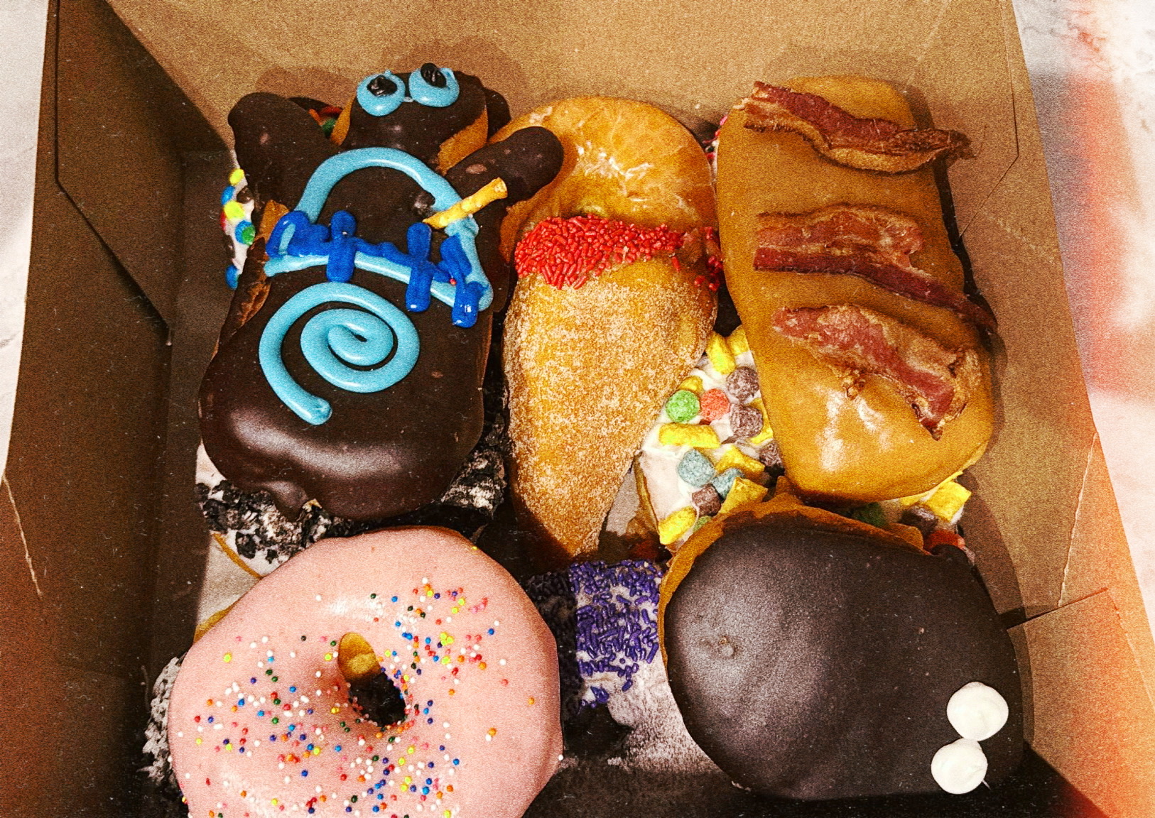
Look at the range: a swirl of electric blue icing, a soft blush pink, a golden caramel topped with bacon. Each hue evokes emotion. Blue feels confident and modern. Pink is playful and nostalgic. Gold, especially when paired with bacon, signals indulgence and boldness.
As brand strategists, we use color the same way donut makers do — to trigger memory, emotion, and desire. The right color palette doesn’t just make something look good; it communicates an entire personality before a word is spoken. It tells people how they should feel about your brand.
Variety as Strategy
This box doesn’t compete with itself; it harmonizes through contrast. The donuts share a visual rhythm — each unique, yet clearly part of one collection. It’s the same principle behind a well-designed brand ecosystem: cohesion without conformity.
Think of it as product architecture. Every item has its own flavor and story, but together they form a system that strengthens the brand’s identity. That’s the art of brand coherence — making diversity look deliberate.
Texture, Layer, and Depth
Some donuts are smooth and glossy, others are powdered or crumbled. The variety of texture creates visual depth and sensory intrigue. The same applies to brand touchpoints. Texture lives in how you layer your messaging, your tone, your visuals, your physical spaces. Flat branding is forgettable. Depth is what makes people want to reach out and touch, taste, and experience more.
Drawing Brand Identity from Product
Every donut maker knows: your product is your identity. It’s not just what you sell; it’s how it feels, how it looks, how it’s remembered. A brand that understands itself at this level can turn even its smallest detail into an extension of its ethos.
When I work with brands, I often ask: If your brand were a box of donuts, which one would it be? The bold maple bacon? The minimalist glazed? The chaotic sprinkle explosion? That’s not a silly question — it’s a diagnostic. It reveals whether your visual and emotional language truly align with your essence.
The Lesson
Inspiration doesn’t announce itself. It hides in textures, colors, flavors, and moments. The key is to stay curious enough to notice patterns where others only see pastry. The world is your creative brief if you’re paying attention.

.svg)


.svg)